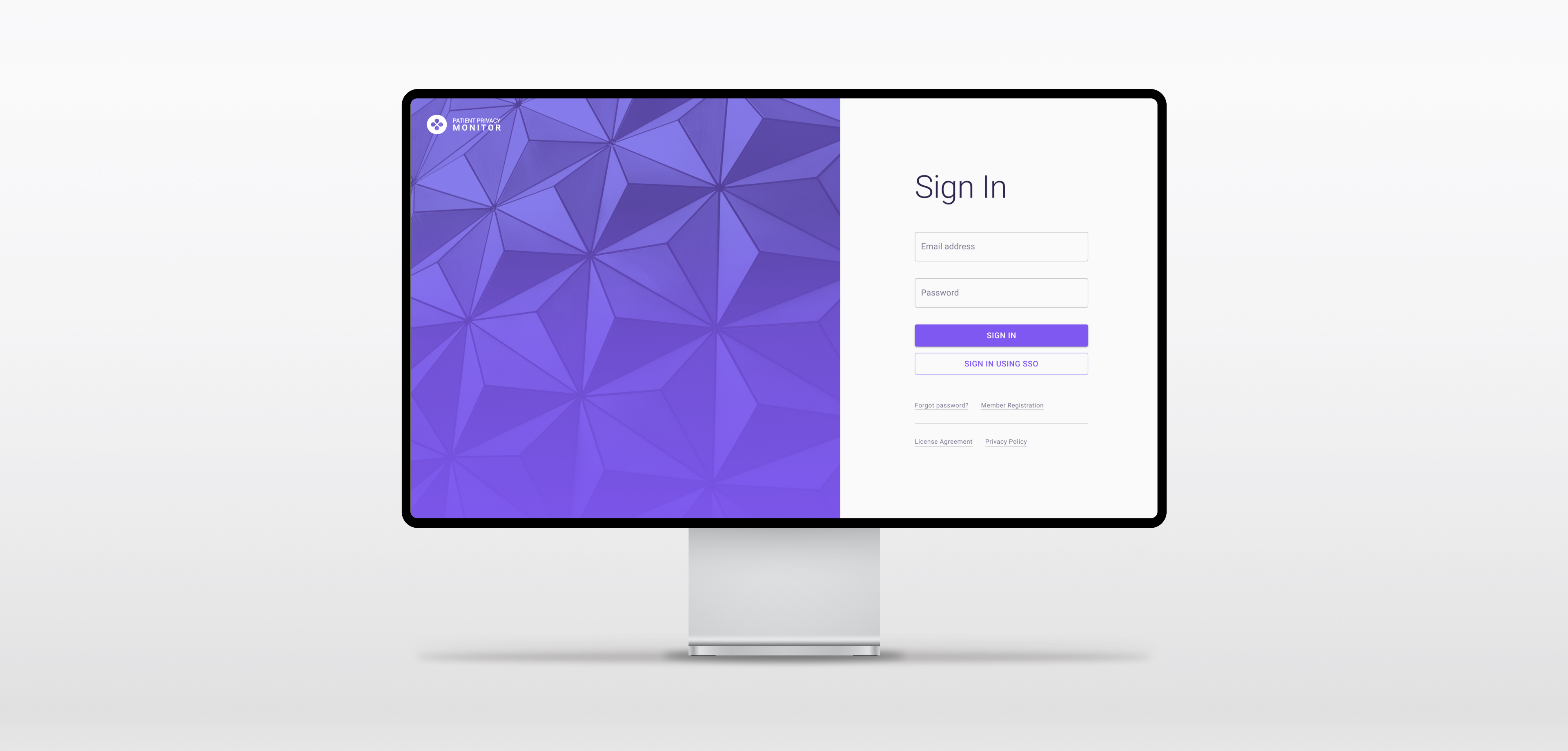
Patient Privacy Monitor is a web application that allows healthcare privacy officers to audit medical systems for suspicious record access activity.
CONTRIBUTION
User Experience
UI Design
User Testing Moderation
YEAR
2021
About the project
Disclaimer
Because of non-disclosure agreements, I cannot go into full detail of everything delivered and developed for this project online. I would be happy to chat more in person if you contact me.
I was part of a team that was assembled to assist a digital identity security company with the need to modernize and improve the overall user experience across three of their separate web applications. The products help organizations solve security, workflow, and compliance challenges by protecting sensitive data and allowing them to manage and secure both enterprise and third-party information. The challenge: each product had different design systems, components and front-end technologies — all implemented by different teams.
Though there were three separate applications to enhance, and each with their own unique challenges, I was responsible for the larger EMR access monitoring platform. This platform provides healthcare institutions with an automated solution to access auditing while also helping to prevent security breaches. With the tool, institutions can better deter inappropriate record usage as well as more easily remain compliant with privacy regulations.
Over the course of the project, my primary responsibilities focused around the following key steps:
01 | Establish a scalable design vision
The three products needed to feel like they came from one ecosystem, and should share matching components and patterns to allow for ease of implementation.
02 | Update the experience with intuitive design patterns and modern interactions
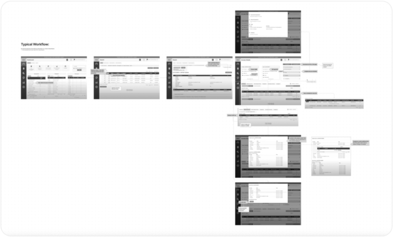
In order to enhance the user experience and further establish design patterns, I honed in on the key work flows and screens of the application.
03 | Test core use cases and work flows with customers
I conducted four user testing interviews over Zoom to gather feedback from real customers on core use cases and work flows.
01 | Establishing design vision
Each product looked and felt completely different from one another. Not only did we need to do away with outdated UI and interactions, but we also needed a system that developers could easily implement across products.
In collaboration with the UX Lead on the team, we created six pillars to guide our approach and design decisions while working on the various applications. They were a result of several onboarding interviews with product owners and SMEs, where they walked us through core workflows and revealed customer behaviors across the products.
In addition, we opted to use Material UI's base kit as the main framework to modernize and enhance the application UIs and experiences. It ensured that designs followed similar patterns, as well as made it easier to leverage existing brand guidelines and introduce them into each application.
⬑ Design Approach: These guides assisted in ensuring that the product designs were consistent, scalable, and of the same ecosystem.
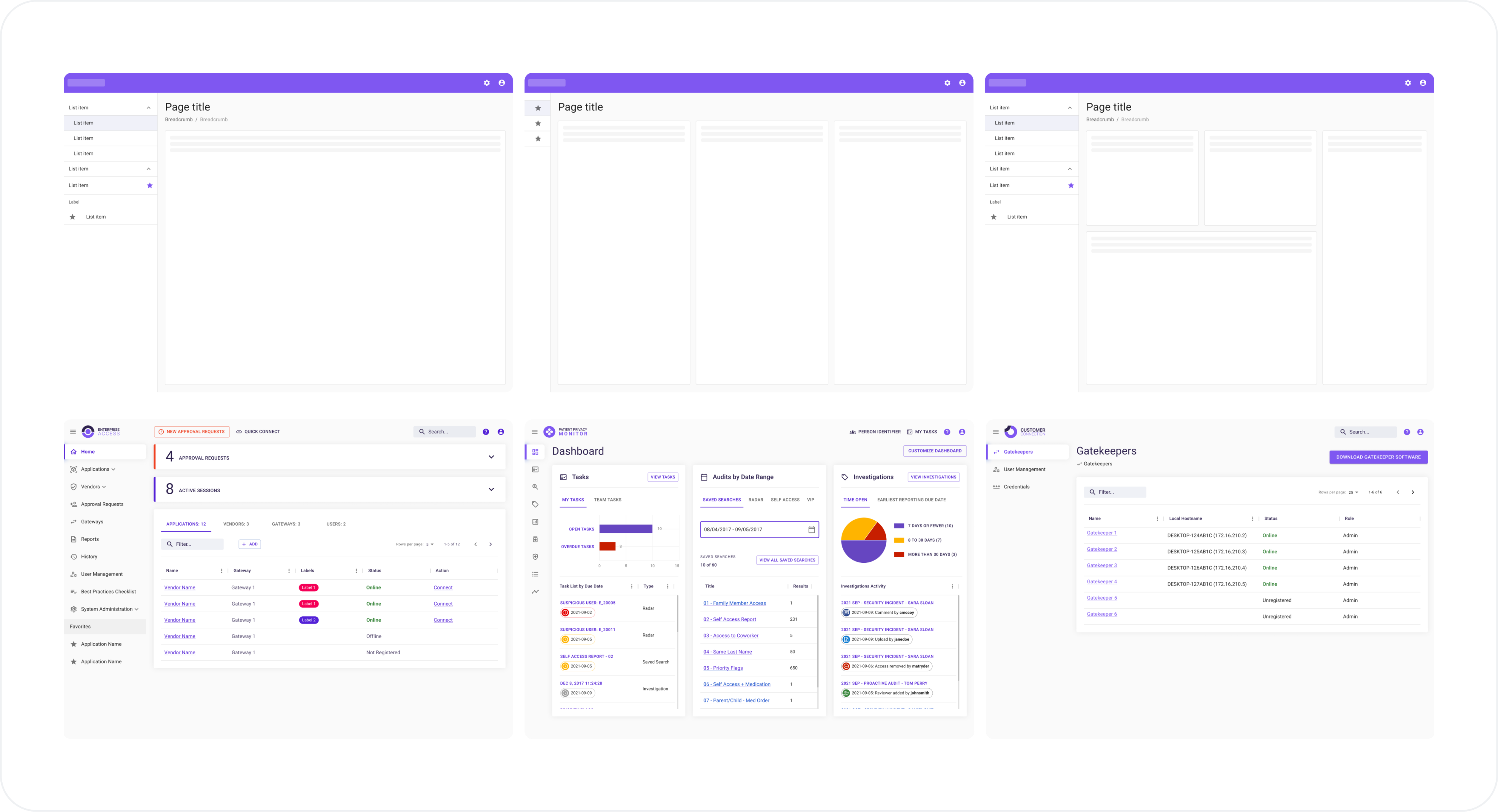
⬑ MUI Library: Using the Material UI design kit, outdated and cumbersome workflows were transformed into user-friendly, modern, and intuitive interfaces that maintain flexibility and consistency across applications. By utilizing the base components as "building blocks," this also assured that developers had a common framework to work from no matter which application they were working on.
02 | Updating the experience
During initial onboarding, I had the opportunity to walk through the Privacy Monitor with the product owner and listen to feedback collected from other SMEs and actual users. Through a process of discovery, definition, ideation, and delivery, I redesigned several key features and workflows that empower users to complete their tasks more efficiently than before. From reducing clicks, decluttering UIs, and emphasizing actionable data or tasks, users can utilize the tool with more precision and confidence.
⬑ Defining behaviors: Onboarding not only revealed key features but also typical user behaviors. Using the provided information, I was able to hone in on pain points and areas where users would get stuck in what to do or where to go next.
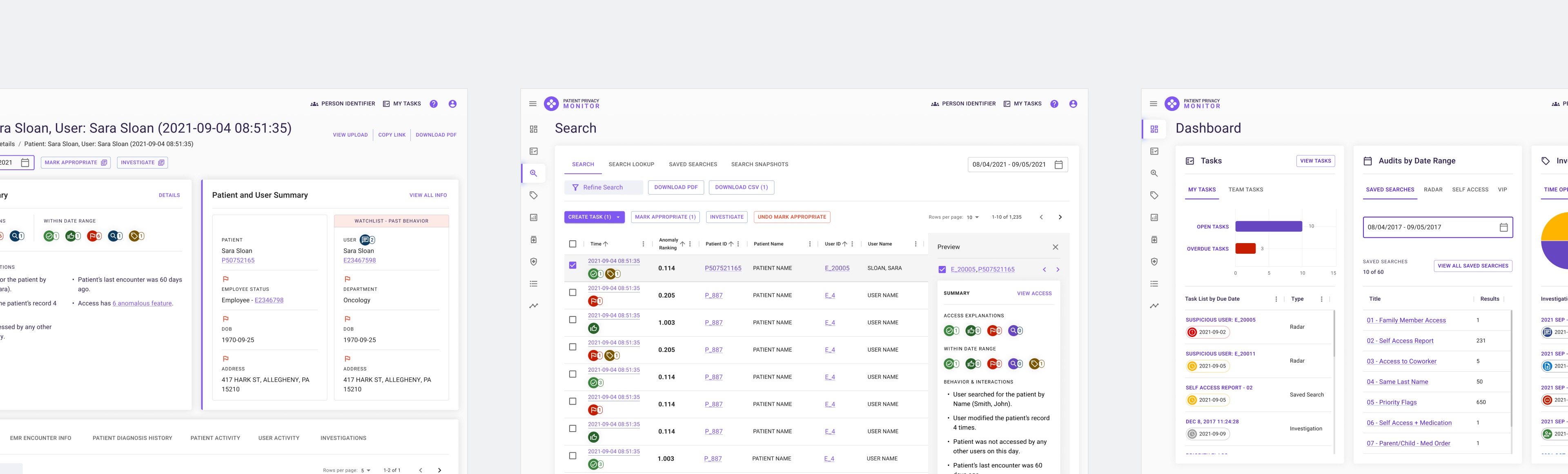
Key screens
Using the Material UI kit and existing company brand guidelines, I delved straight into designing high-fidelity wireframes for key screens with the purpose of establishing an overarching design structure. By starting with key screens, I was able to ensure designs were aligned with work being done in tandem on the other applications, as well as prepare for more detailed workflow designs. Some example key screens are below.
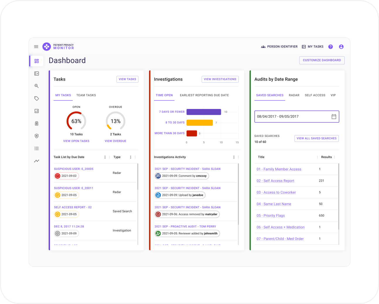
⬑ Dashboard: A simplified yet informative dashboard applies patterns not only to bring forward key data and metrics, but also to drive users to prioritize and track their assigned tasks.
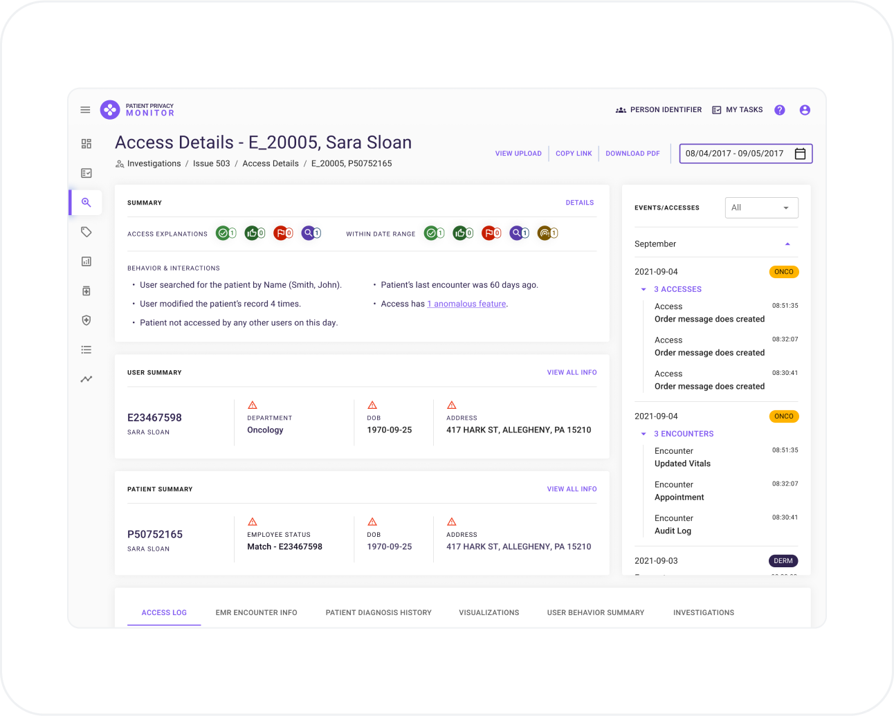
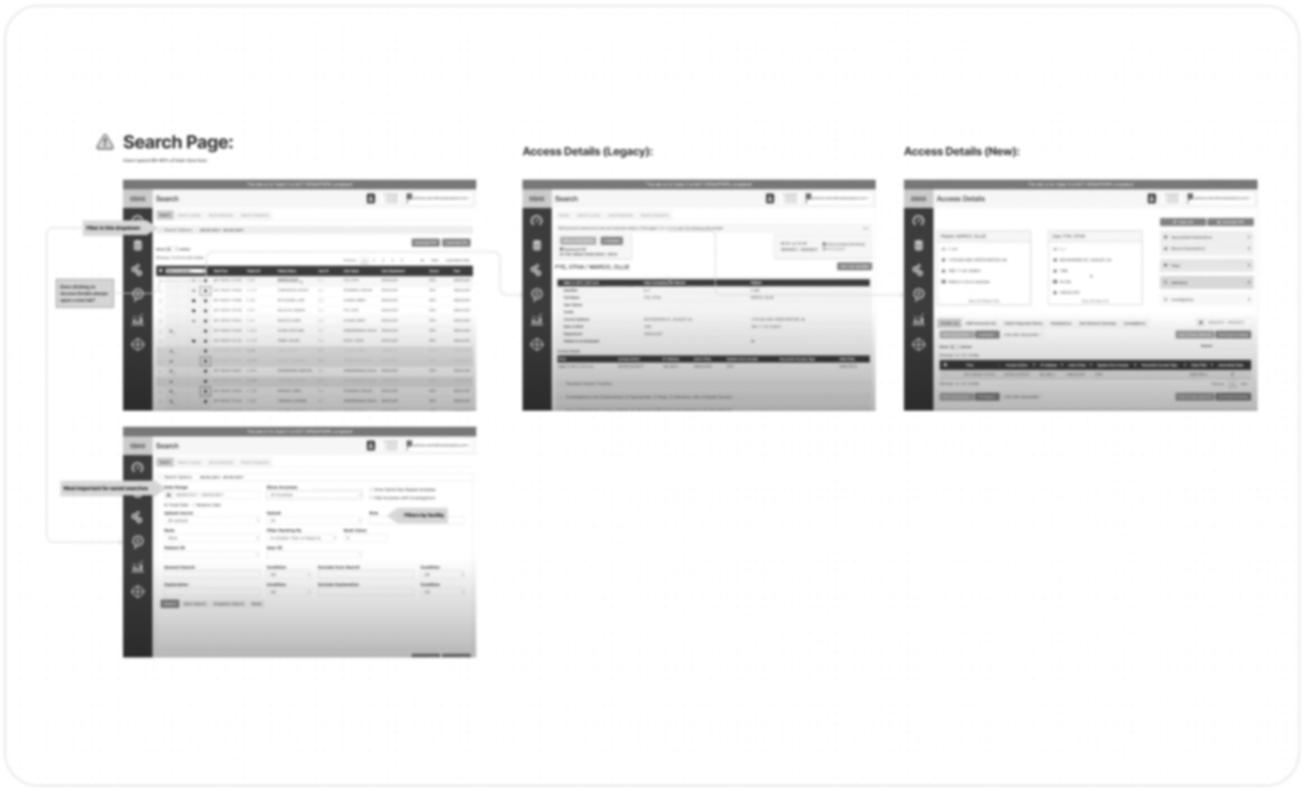
⬑ Record Access View: Uncluttered and user-friendly interfaces allow users to more quickly understand suspicious scenarios and make key decisions faster and more precisely.
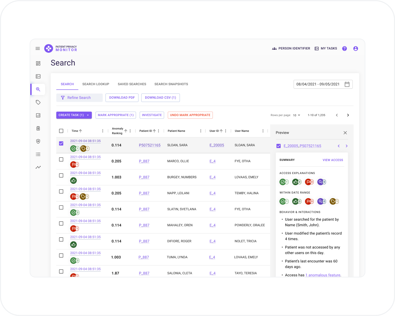
⬑ Access Search: A complex screen proven to generate work and drive task creation has been simplified and enhanced to give users a preview of activity without having to navigate to another screen as was previously the case.
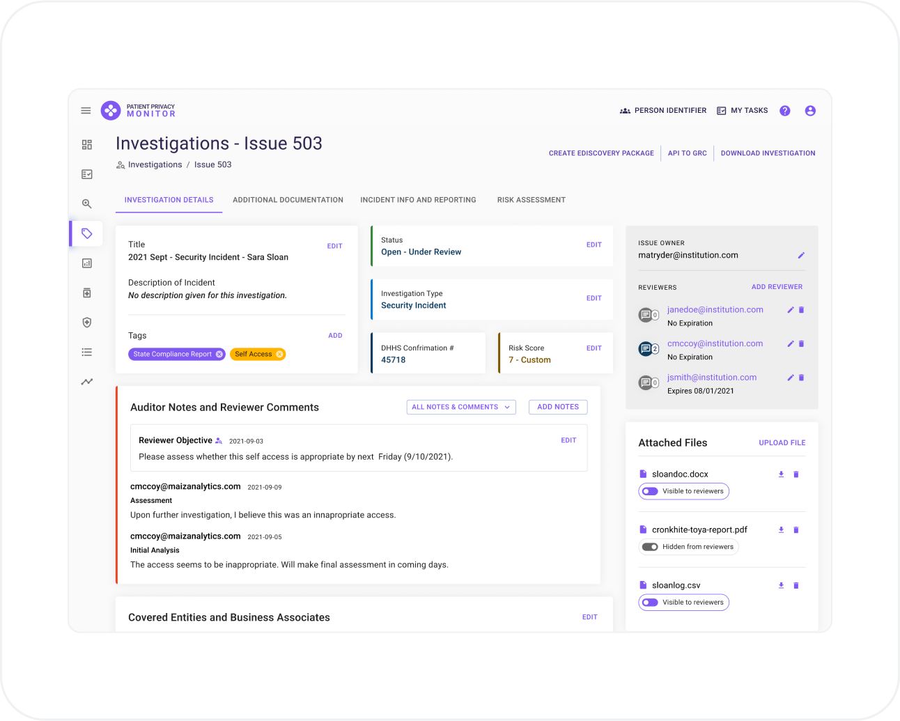
⬑ Investigation Detail View: Crucial investigation processes and information have been compartmentalized into easily accessible tabs, allowing for easier collaboration and progress, as well as ridding the UI of extremely long scrolling.
03 | Testing core use cases & flows
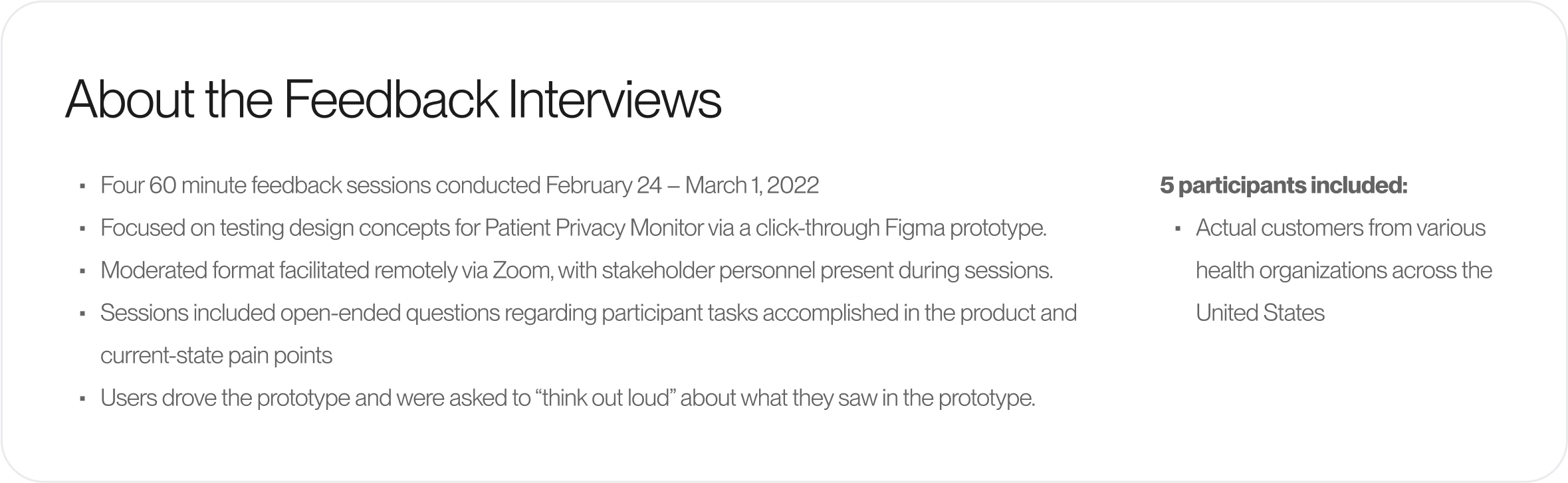
After creating iterations and showcasing with internal stakeholders over the course of several weeks, it was time to validate designs with users in order to ensure that UX and implementation risks were mitigated as early as possible. I participated in four feedback interviews with five customers from various organizations.
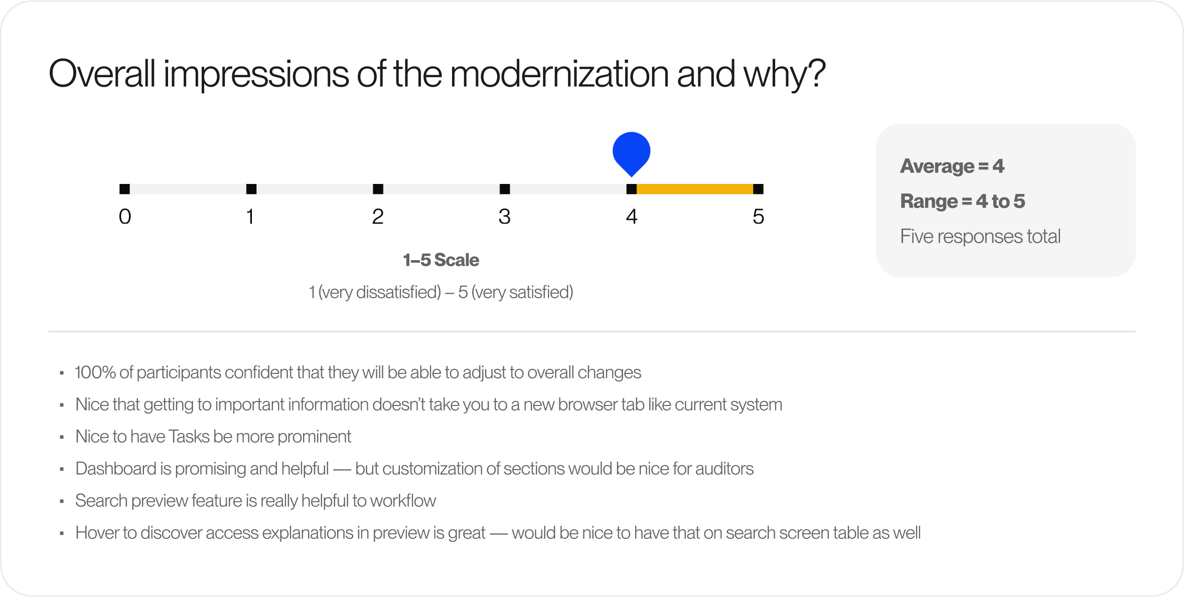
After evaluating all the data collected, designs were updated to accomodate feedback most pertinent to the current sprint. During this phase, I contributed to defining what were must-have, future, and nice-to-have tasks. Must-have tasks for the MVP revolved mostly around more strongly emphasizing key actions across various screens; further simplifying table grids throughout workflows, and reevalutating color usage for data points and visualizations to ensure it is meaningful for crucial decision making.
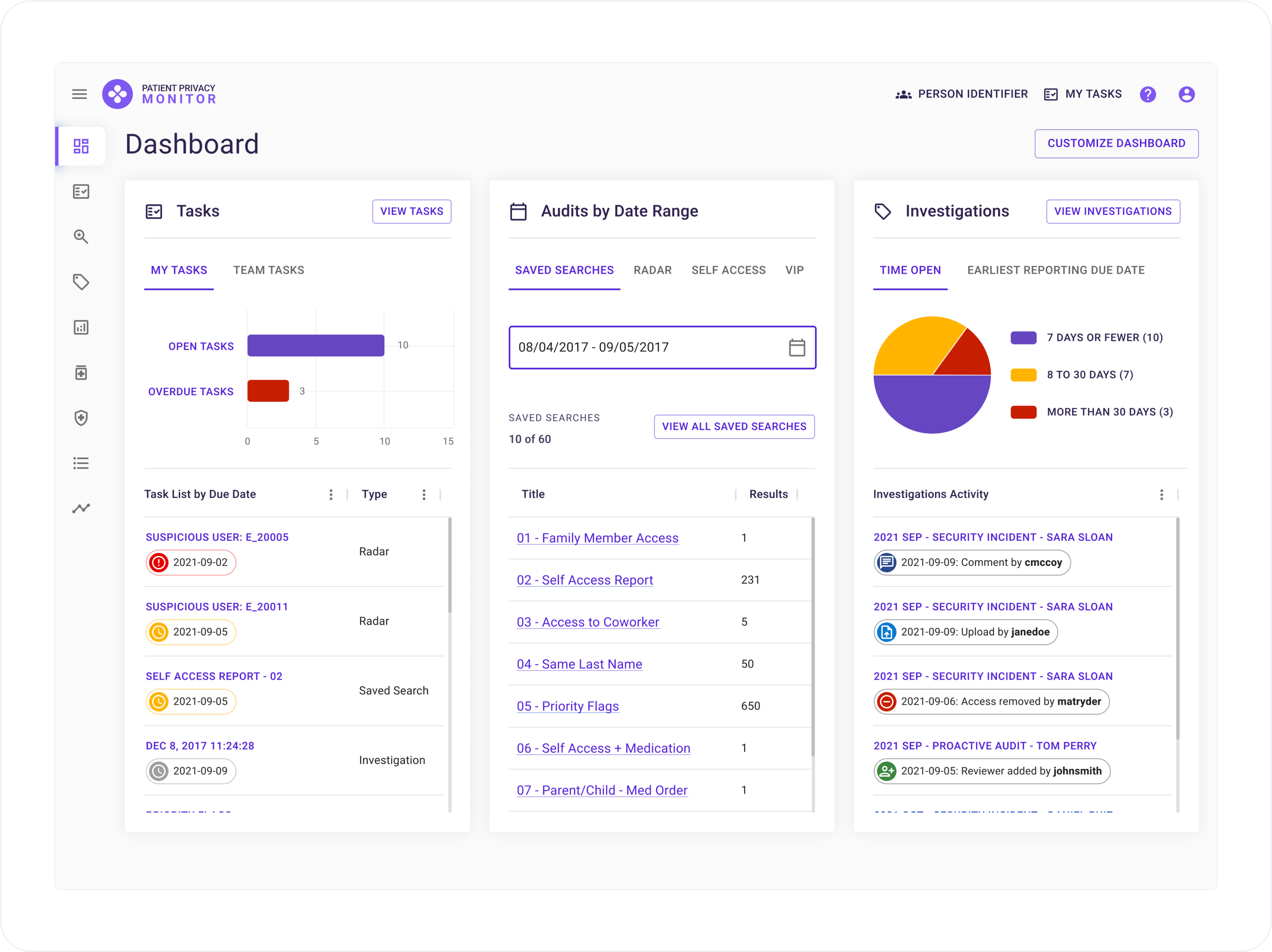
⬑ Dashboard: This screen was simplified even further to reduce cognitive load and allow for additional data categories to be included.
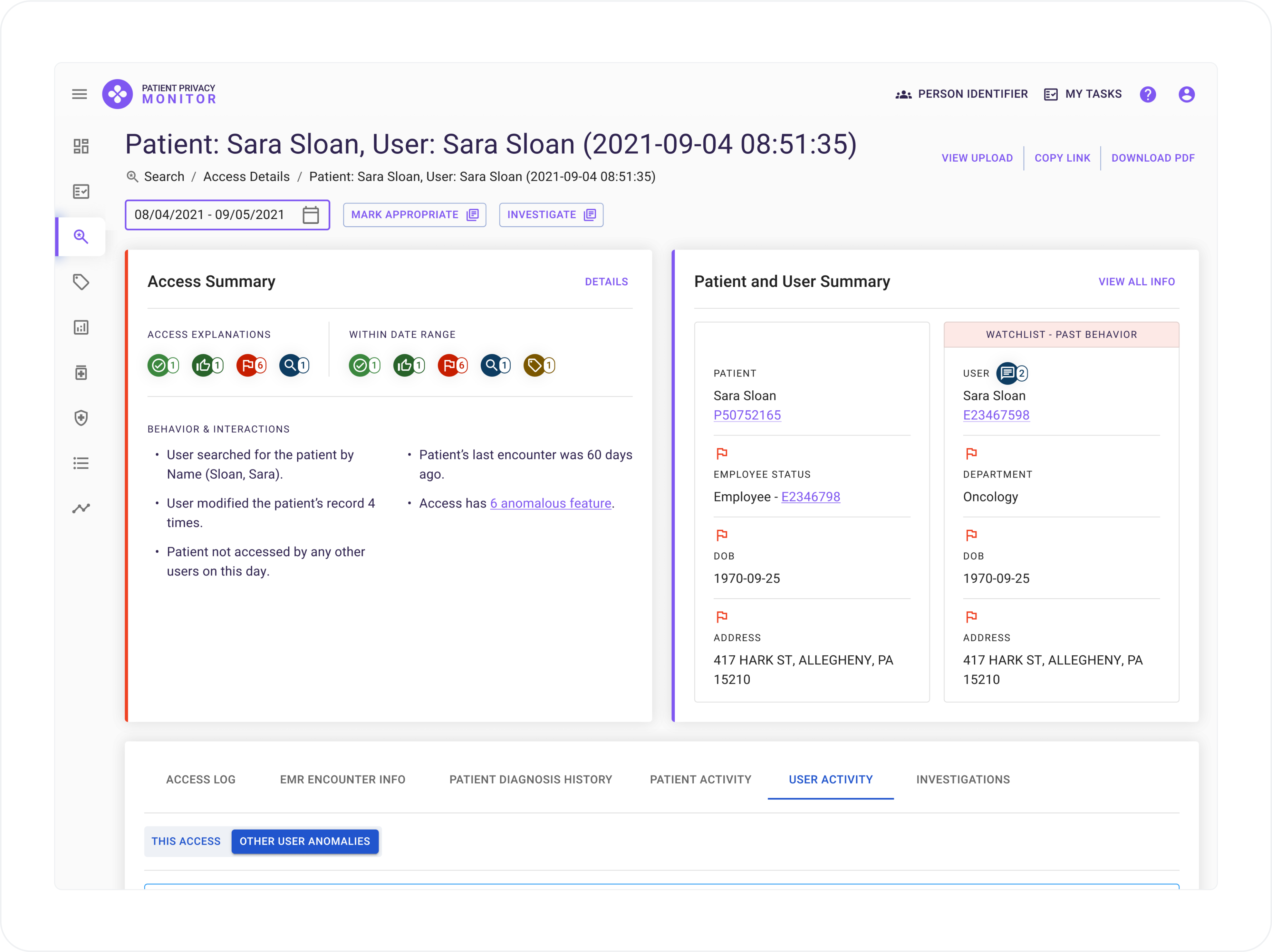
⬑ Access View: Data sections were reorganized to emphasize summarized data that users reference to determine whether an access needs deeper investigation or not.
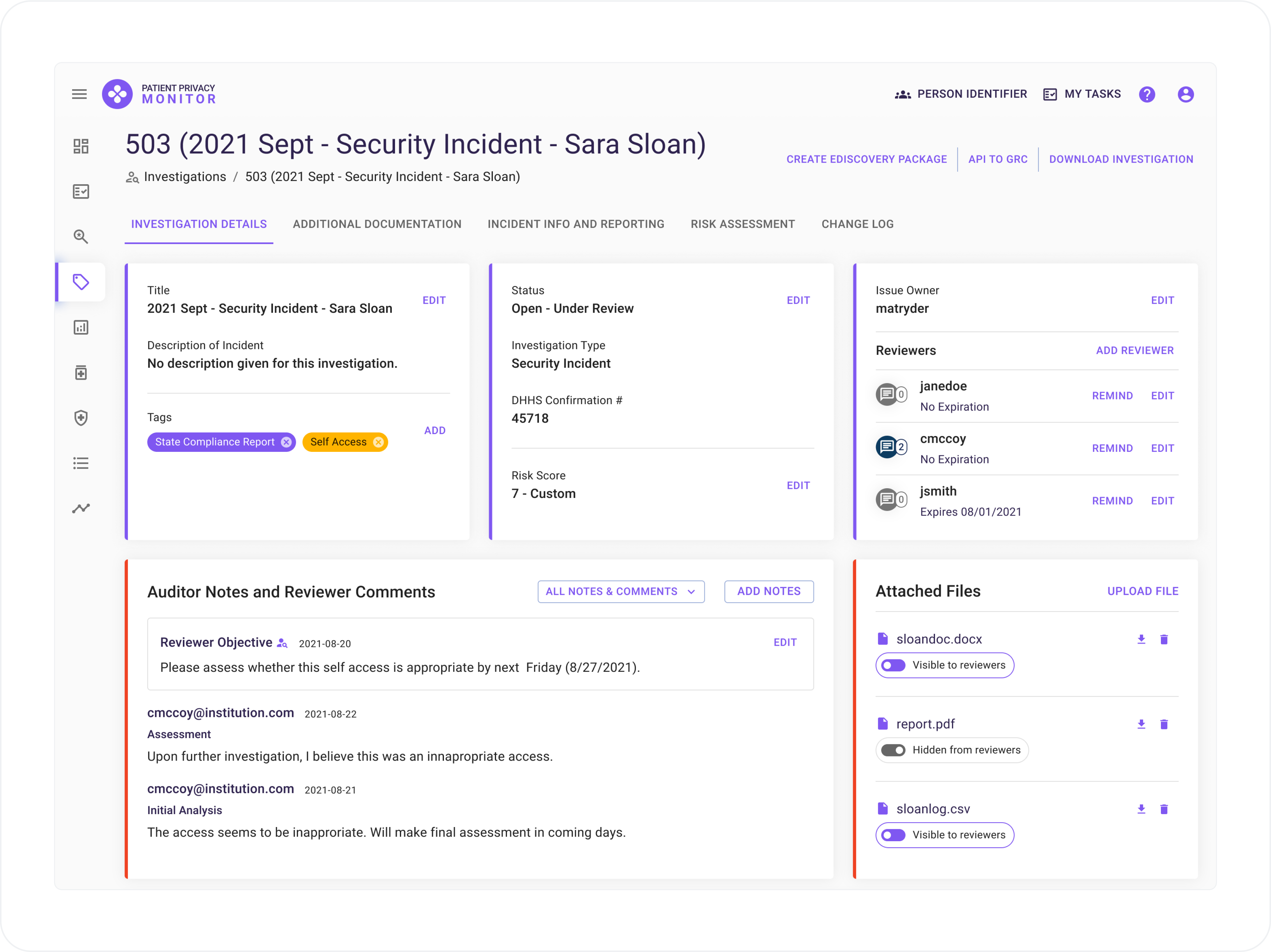
⬑ Investigation Detail View: Panels were simplified and information consolidated to bring consistency and to ease the reported feelings of being overwhelmed.
Outcomes
- Research and designs delivered over the course of 5 months
- High-fidelity Figma prototypes, designs, and components for implementation
- Modernized and customer-centric
- Ideas for additional enhancements for future sprints
